Cigar News
Tatuaje’s New Logo
January 2010

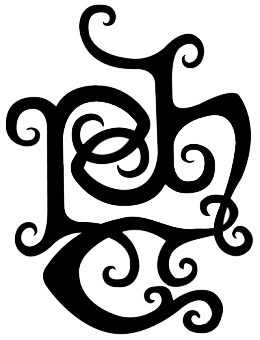
Tatuaje’s website has recently been updated with a new logo, direct consequence of a lawsuit with Altadis. Whereas it’s definitely more complicated than the fleur de lys (it looks like an elvish rune to me), I am fairly sure that with time it will become easily recognizable by every cigar aficionado. What do you think?
10 thoughts on “Tatuaje’s New Logo”
You must be logged in to post a comment.

Tatuaje is tattoo. Guess it looks kinda like a tattoo. That’s all I can figure out. I bought the Dr. Jeckyll/Mr. Hyde lighter and initially thought it had to do w/ that. You all seemed to have figured it all out. Thanks.
Clearly it says Pete Johnson…
Terrible. He needs a good graphic designer because this logo looks like he hand drew it himself.
It’s messy and confusing everything a logo should not be.
Yeah, more dressing to pay for. See my comment on the “Drac” from a few days ago. A three dollar figurado for $13, you are paying $5 for each fang. No charge for the unseasoned coffin, due to the screaming the cigars made by being forced into such a ridiculous box. See, you do get something for free.
The tobacconist formerly known as Pete?
I was just corrected…I’m now told (by @mattmaronna on Twitter) that it’s PJHC, meaning “Pete Johnson Havana Cellars.”
Not so sure how I feel about the logo aesthetically, tbh.
It kind of looks like PJC (read left to right, top to bottom) with some tribal embellishments. Pete Johnson Cigars?
Yeah. What is that?
Agreed….wtf?
love all his smokes. don’t like the new art at all, but im not smoking the companys logo, so i guess in the end, it doesn’t really matter. will keep enjoying petes blends.